UX / UI Designer, Illustrator, Photographer
To me, design isn't just about making things pretty, it's about transforming ideas into experiences people can feel, use, and remember. That "effortless" look we all love? It's the result of messy sketchbooks, late-night iterations, and a lot of strategic thinking.
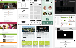
I'm a UX/UI designer, illustrator, and photographer who turns concepts into intuitive interfaces, storytelling visuals, and images that resonate. My work is about bridging imagination and intention — where creativity solves real problems.
Let's turn ideas into something tangible (and make it look damn good while we're at it).
"Design is thinking made visual." — Saul Bass