Heuristic Analysis
Comprehensive evaluation using Nielsen's 10 Usability Heuristics, documenting severity ratings and recommendations for each violation.
View heuristic AnalysisIdentifying Critical Usability Issues in a Government Website
As part of my UX/UI studies, I conducted a comprehensive usability analysis of the Australian Institute of Aboriginal and Torres Strait Islander Studies (AIATSIS) website. The goal was to identify usability issues and propose design improvements that would better serve the site's diverse user base.
Through heuristic evaluation and user testing, I discovered that the AIATSIS website suffered from significant navigation problems, poor information architecture, and cultural sensitivity issues that prevented users from easily accessing important cultural resources.
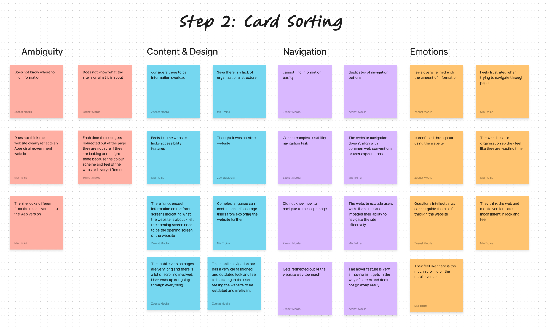
Systematic analysis using Nielsen's 10 Usability Heuristics
Result: 19 usability violations identified
Task-based testing with 5 participants representing diverse user groups
Result: Navigation and comprehension issues confirmed
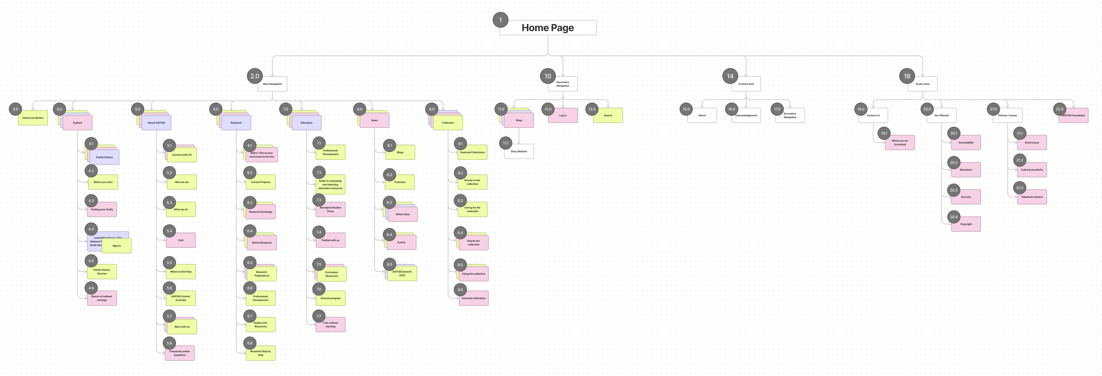
Information architecture analysis to understand mental models
Result: New navigation structure proposed
Comprehensive evaluation using Nielsen's 10 Usability Heuristics, documenting severity ratings and recommendations for each violation.
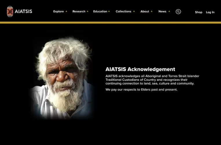
View heuristic AnalysisThe acknowledgement to Country was hidden at the bottom of the page. For a cultural institution, this should be prominently displayed as a sign of respect and recognition.
The same navigation menu appeared three times on a single page, creating confusion about which to use and why they were duplicated.
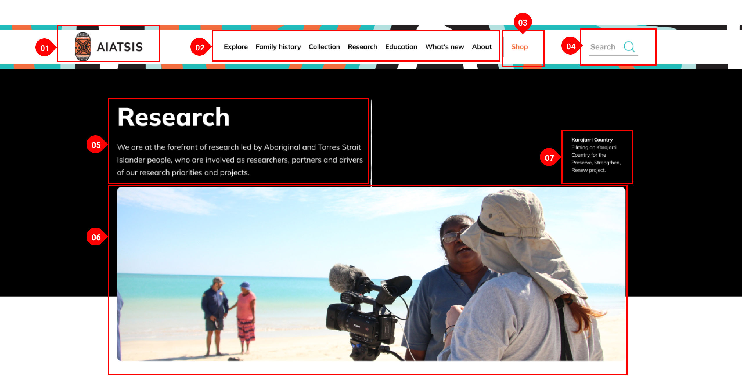
Users couldn't determine what AIATSIS was or what services it offered without extensive scrolling and exploration.
Based on card sorting results and user feedback, I restructured the site navigation to create clear pathways to content:
Original homepage with repeated navigation, buried cultural acknowledgement, and unclear site purpose.
View Navigation Flow Before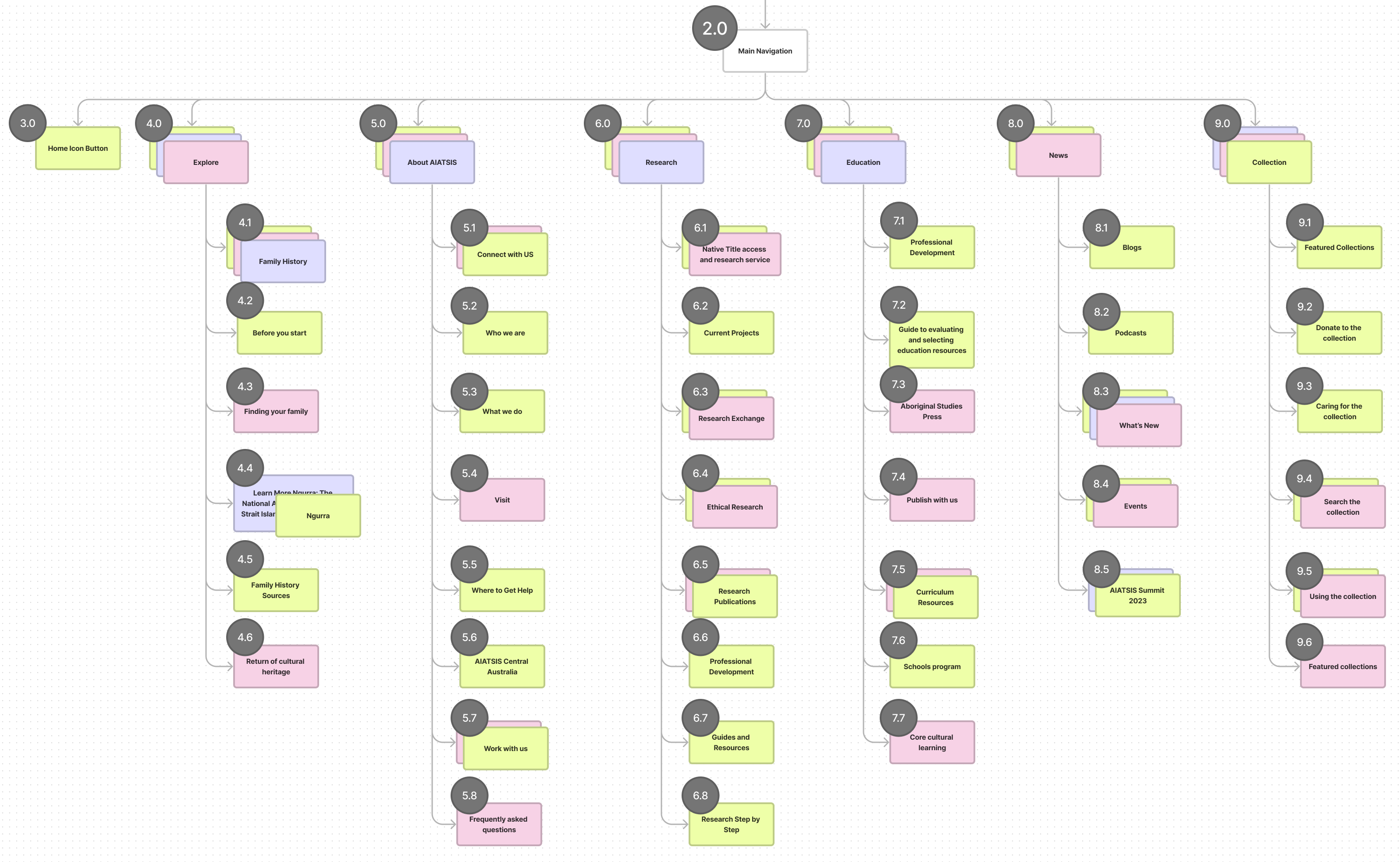
Redesigned homepage featuring prominent acknowledgement to Country, simplified navigation, and clear mission statement.
Moved acknowledgement to Country to a prominent position at the top of the homepage, reflecting its cultural importance.
Eliminated redundant navigation menus and created a single, clear navigation system with logical groupings.
Introduced clear hero section explaining AIATSIS's mission and purpose immediately upon landing.
Incorporated Aboriginal art patterns and earth-tone color palette inspired by ochre, sand, and natural elements.
Low-fidelity wireframes testing new information architecture and layout
Testing wireframes with participants to validate navigation improvements
Incorporating cultural design elements and brand guidelines
Creating clickable prototype for final user validation
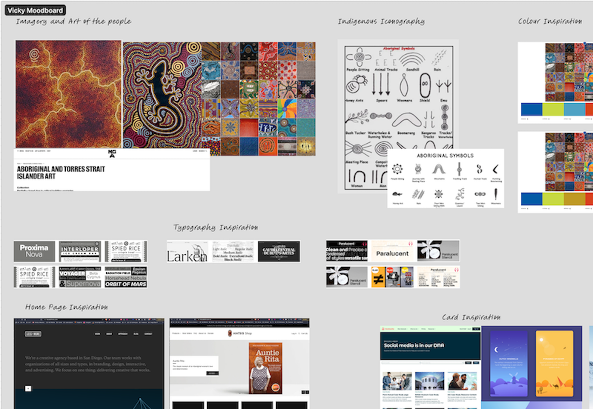
Cultural inspiration using ochre, sand tones, and Aboriginal art patterns.
View Full Moodboard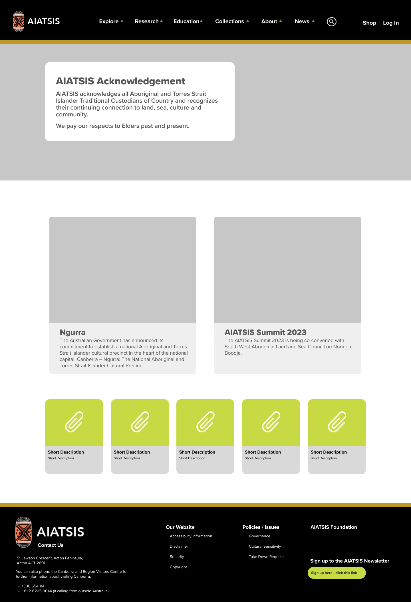
Testing new navigation structure and content layout before adding visual design.
View Full Wireframes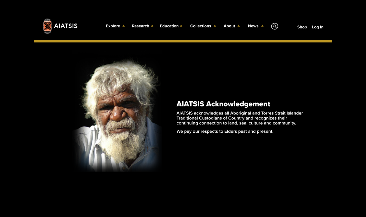
Complete design incorporating cultural respect with modern usability.
View Full PrototypeUsability Issues Identified
User Tests Conducted
Task Success Rate Improvement
Learned the importance of culturally appropriate design decisions, especially for institutions representing Indigenous communities. Design choices must reflect and honor the cultural values of the organization.
Gained hands-on experience with heuristic evaluation, user testing, and card sorting. Understanding how different research methods complement each other was invaluable.
Discovered how crucial clear navigation and logical content organization are to user success. Even small structural changes can dramatically improve usability.
This project taught me that good UX design isn't just about aesthetics — it's about understanding users deeply and solving real problems. The most meaningful insight was recognizing how design decisions can honor cultural values while improving functionality. Moving the cultural acknowledgement from the footer to a prominent position wasn't just a usability fix; it was a statement of respect and recognition that aligned with AIATSIS's core mission.
If I were to continue this project, I would:
click image for full working prototype